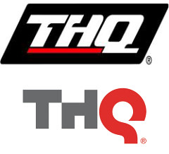
 THQ has issued a press release announcing they’ve changed their logo.
”Our new logo epitomizes the change, innovation and creative growth that are the cornerstones of the new THQ, “said Brian Farrell, THQ President and CEO. ”By developing triple-A, innovative, original intellectual properties, attracting the top talent in the industry, and placing that talent first, THQ continues to redefine itself. This new logo seeks to capture that change and make it tangible.”
The old logo did seem a little dated, trying to look futuristic, but these days, it’s come off as sterile and dated. The new logo is rounder and more fluid. It doesn’t capture any sort of vibe, however, and just looks placid. It’ll be interesting to see how it moves in a videogame bumper, however – those rounded edges can be very animated in a video.