Wildlife Park 3 feels like a very cheap game. Even the menu screen is shoddy, which takes over a minute to load up. When you finally get to the game you have two options – campaign or freeplay. Campaign covers 20 missions of varying difficulty, most of which just feel like extended drawn-out tutorials for the freeplay mode. One mission can be done in minutes, others take hours, and some seem like days.
 |
| Yes, it’s really this exciting |
The tutorials themselves are particularly stupid, and I can guarantee that you will not enter freeplay with all the skills you need. Sometimes you’re even given incorrect instructions, like this one for moving animals: “select an animal and then click OK to move it to another spot”. Along with there blatantly being several steps missing in those instructions (like actually moving it), there isn’t an OK button.
Sometimes it’ll say you can do something, but not how to. I spent far too long trying to work out how to replace small restrooms with better ones (which you have to do to progress) before giving up and just bulldozing the entire area. Then if that’s not enough, the game gets far too complicated quickly. You have to worry about permits, soil types (for plants and animals), water levels, prices, not to mention trying to work out why they’re building a zoo in the middle of the African savannah.
Eventually things settle in and you’ll be able to mentally work out what plants would work where, what to charge for hot dogs, even how to replace things (you can’t, you have to sell them). This is the point where the game threatens to get enjoyable. It certainly has the spark of addictiveness common to all good sim games, which I discovered when I was still awake at 2am playing it.
The game’s major difficulty comes from trying to navigate the menus. It has to be one of the most cluttered and badly designed displays I’ve ever seen. The problem isn’t that it’s laid out badly or has too many sub-menus, it’s actually laid out okay and most things are available with one or at most two button clicks. So what’s the problem?
It’s just that there is so much information available, and every single button looks the same. With their button designs bitComposer have gone for stylish over practical. They’re all the same dull-yellow colour, and the faint slightly-darker-yellow icons on most of the buttons are often utterly indecipherable. You’ll spend half your play time clicking through all of them trying to find the page you want.
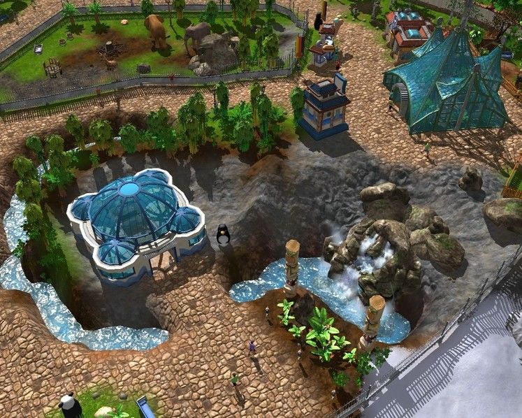
Graphically the game is colourful but even on Very High settings it looks about ten years old, and is still prone to slowdown. Rather surprisingly it uses the Gamebryo engine that powered Oblivion and Fallout: New Vegas. This makes Fallout look like Crysis in comparison. In terms of audio the voice acting is utterly painful, and the actors sound equally tortured. Their forced laughs are cries for help, but no one is listening.
 |
| From the day we arrive on the planet, etc |
While over-complicated in execution, the range of options available is still truly impressive. Many won’t be available until your park increases in reputation, but that shouldn’t take long and that’ll give you access to more features, like ice cream stands, monorails, balloon rides and of course a better range of animals.
There are still two problems here. One is probably my fault, which is that no matter what I did I always seemed be spending more than I was earning. It’s not just a matter of raising prices too, as even when they’re dying of thirst customers won’t buy a mineral water if it’s too expensive. To keep every person, animal and plant even minimally satisfied, you have to put yourself out of pocket.
The worse problem is that despite the addictiveness of the game and the massive range of options which will always keep you occupied, there comes a point where it just gets boring. You’ve crammed in what you can, reorganized your fences so that a nice safari track runs through it, and added flags all over the place, but no amount of new animals will change the fact that you’re running over worn ground. The animals may change, but the grinding process stays the same.
Even when the game gets desperate and starts adding extinct animals like saber-toothed tigers it’s still hard to care. Putting zebras in the lion enclosure doesn’t help either, as the lions seem too civil to eat either them or the gardener who keeps wandering through the open gate. Not sure I’d want to visit a zoo with an open-door policy for lions. Furthermore, I’ve checked and previous Wildlife Park had animals attacking humans – why would anyone want to take this option out?!
 |
| Ahh, I see my recreation of the Emerald City has finally been built! |
There aren’t any multiplayer options in case you were wondering, like checking with your friends to see whose zoo was doing better, maybe pinch or share animals or sabotage rides. Those would’ve been nice. That’s the most frustrating thing about Wildlife Park 3, it’s so safe and tame. When even saber-toothed tigers look like pussycats, you’ve got to question whether “family friendly” was the right thing to aim for. Despite the lack of gore this certainly isn’t for kids though, as they’d either be bored or overwhelmed in seconds. I know I was.
Wildlife Park 3 starts off badly, gets good and addictive for a while, and then descends into mediocrity once more. The menus are totally unintuitive in design, and you’ll never be able to find the option you want immediately. Worst of all though, after a few hours you’ll just get bored, stop playing and never touch the game again.
Oh, and it’s a female sea lion, by the way.
WILDLIFE PARK 3 VERDICT
Oh, and it’s a female sea lion, by the way.
TOP GAME MOMENT
When you get your park to level 3 satisfaction and the cool stuff finally opens up.


