It’s worrying right up until I realize that the reason they’re short is because, watching the live demo running on a beefy-looking PC earlier this week, I was slack-jawed. It’s early days yet, with the game not due until 2013 and with the Maxis crew only showing off a small number of basic Sim City features – but this looks like my Sim City.
 |
| This Concept is surprisingly accurate to the full game |
For the record, the first Sim City game I experienced was the SNES title, where a green-haired caricature of Will Wright guided you through a Nintendo-developed reimagining of the original computer-based title. From there I moved to Sim City 2000, which I loved more, and 3000, which is where my interest started to wane.
Lessons have still clearly been learned from the less successful titles in the series such as Sim City 4 and Sim City Societies, though. The colourful, vibrant artistic style reminds me of Sim City Societies or even the Sims. Rather than trying to ape a real city in an absolute manner, this new title’s cities are caricatures with over-the-top, chiselled profiles.
The reasoning behind this isn’t just to look pretty – it’s in fact driven by some key changes to the gameplay. During the presentation we were told that the philosophy of the game is ‘what we sim, you see’ – and that means rather than graphs and charts, the game feeds back to you in a tactile way through the city itself.
One area of the demo city had an issue with crime. Rather than an advisor, a newspaper or a wordy pop-up explaining things, it became obvious another way – the sight of police cars on the streets became more frequent, their flashing blue lights visible zipping around the roads. Zooming in a little further revealed graffiti covering houses top-to-bottom – and it became clear we needed another police station.
These cues are well built and easy to spot. If part of the city is starved of power, lights will go out, buildings left darkened – there’s no need here for a little red electricity bolt above a building to alert you. More normal warnings exist, though, as individual Sims will come to you and ask you to fix or change problems that affect their normal lives.
Those police forces or even power isn’t some imperceptible thing here, either. Every car on the street is an actual object with a destination; a purpose, a mission.
If you turn on the power grid so you can see it you’ll see the power grid laid out. Balls of yellow light travel from the plant out into the grid, and each building they pass that they provide power to shrinks the size of the ball until it poofs out of existence entirely. You’ll want to make sure there’s enough of those balls of power to reach the entire grid, and when the power layer is on areas of the grid that are power starved will appear a bright red.
Dropping buildings into the fray is now easier, with a snappy, tactile-looking process that makes it really easy to see what you’re doing. Curved roads can now be ‘drawn’ into place, and zoning pulls from Sim City 4 by still naturally inserting tiny roads into them while seeming to maintain Sim City 2000’s sense of freedom.
Coverage of buildings like Fire Stations and Hospitals are made clearer by lines that appear down the road. Like the power grid, they range from Green through to Red, traffic light style. Any road with green would have good fire coverage, and the further you get from the station the worse the coverage is until the line is red, meaning there’s no fire coverage at all.
If you can’t quite afford a new Fire Station to make the influence extend a little further, another nice new addition comes in the form of building add-ons. Why buy a whole new fire station when merely buying another garage and truck will do the trick? Slamming down that additional garage will take up more space and actually alter the appearance of the station, too.
You can even add signage – making it clear a fire station is nearby will make Sims feel more safe – or a bell, which will ring and alert Sims there’s a fire nearby when a truck is deployed to an incident. The same ideas are true of other buildings, and their appearance changes as well as the effect they have.
The way the information lines, buildings and city change and shift dynamically to show you what’s happening in the city is incredibly clever; that vibrant, caricatured art and colour style that’s so pretty serves the simulation. The idea is a simplistic one, but it is one executed incredibly well – they make the data that’s so important to creating a good city more fun and engaging it by making it more visual.
I’ll be interested to see if the team handling The Sims takes anything away from this, as that’s a game where the basic needs of a Sim are still reduced to a bar on the bottom of the screen. Sim City does away with that, and looks and feels more exciting because of it.
That system appears to extend out to most major services, though Maxis said they were keeping how some major systems including the always-fiddly water system under wraps for now. We can expect more detailed information in a month and a half’s time at E3.
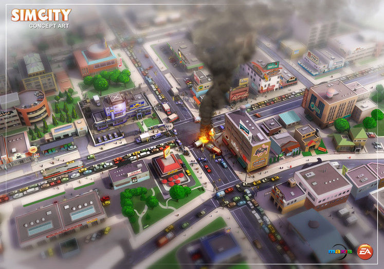 |
| Vibrant colours and clever systems dominate |
Sim City seems to keep a firm grasp on retaining its depth, but it is also a game that is full of tweaks and changes to make it more accessible and easier to jump into. Titles like Sim City and 2000 feel like they perhaps had a beautiful simplicity by mistake, but Maxis have clearly spent a great deal of time here trying to duplicate both sides of the coin.
If the rest of the in-game systems boast as much depth with as many clever tweaks as the ones I saw like traffic, Police, Fire and Power did in this demo, this game has a chance to be genuinely incredible. Roll on 2013.
Most Anticipated Feature: Can’t wait for them to show what the score is with archaeologies, briefly teased in the trailer.
